The Roku Channel Web Sign Up
Increasing free trial and conversions


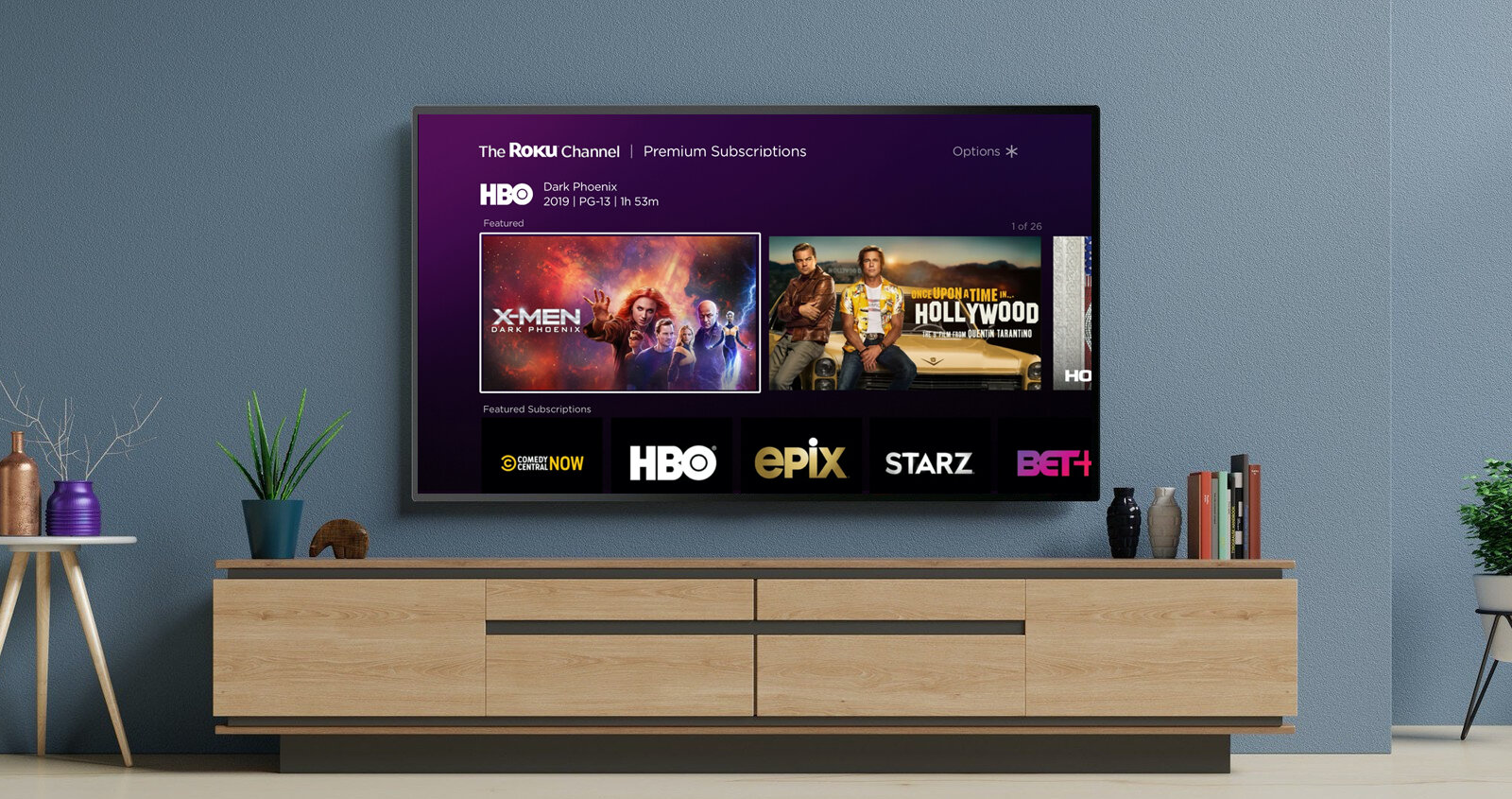
The Roku Channel's content partner landing page is a collection of the partners content catalog. It facilitates content discovery but also presents a paywall to start a subscription. As Roku continues to engage with media studios to offer a variety of subscription products and add-ons, a scalable paywall design is essential. While various areas of the sign-up flow needed improvements, data analytics and user research showed that optimizations that impact subscription browsing and plan selection should be the top priority. To lower the friction leading up to a free trial or subscription purchase, my team and I worked closely with cross-functional leads to optimize the web sign up flow.
Current design: Most partners use the single plan layout, but the adoption of the multi-tier layout increased in the past year.

Funnel drop off
From funnel data, within a four-week period over 450K visitors selected a plan on the paywall per month. However, only 17% subscribed due to a large drop-off early in the funnel.

Design template limitations
As our partners develop and diversify their subscription offerings, our current design has found it challenging to accommodate a wide array of subscription products and upsell scenarios. This issue is particularly evident with sports partners, who offer a variety of plans, including seasonal subscriptions, multiple annual billing options, and sports package bundles.

A review of web paywalls across the media industry was performed to examine a variety of platforms from video and music streaming services to news publishers. This exercise found a common trend towards using a fullscreen layout that presents each subscription plan with a card component.

Following the collection of quantitative data and user research insights, we set out to achieve the following:
Hypothesis
Separating the paywall from the publisher landing page, allowing it to function independently, will lead to an increase in free trial initiations and conversions. Despite introducing an additional step in the signup process, this approach will enhance the overall user experience by not further distract the prospect to start a subscription (their original intent) and yield more favorable outcomes.
1. Partner landing page layout shifts user behavior from purchase to browse
In user studies, high-intent customers were distracted from the visually compelling rows of content below the subscription plans. The layout of the partner landing page shifted their mindset from making a purchase to browsing, interfering with their original goal to watch a specific piece of content in the discovery and define stages.

2. Reduce number of steps to play content after purchase
Customers come to a subscription service sign-up with some enticing content in mind. After a user successfully started a free or trial or subscription, they were redirected to the partner page. The flow logic didn't consider the users context before the subscription sign up process. This resulted in additional steps (and frustration) for the user to get to their goal of playing a specific piece of content. After subscribing, users expected the content to play immediately.
3. Design systems fragmentation decreased predictability and trust
The web subscription flow relied on two web design systems built by independent teams. The authentication and checkout process (sign in, account creation, and review order) used different design components and color palettes from the consumer-facing discovery and search screens. Users felt the sites use of colors, layout, and font choice to communicate the terms of sale effectively felt disjointed and low quality.

After considering multiple proposals, we narrows on two design approaches that we believed would meet our project objectives and achieve the desired results. These proposals were further user tested.

Mobile web versions

Localization
Further modifications to the designs were made for better suitability in Latin American countries, Canadian French-speaking regions, and the UK.
We successfully rolled out the new design to all 60+ partners offering multiple plans, leading to an increase in annual revenue.


Free trial starts
Roku Pay conversions
Projected annual revenue boost
Now that the flow was shortened and design framework has been established, we will continue A/B testing and iterate. These include: